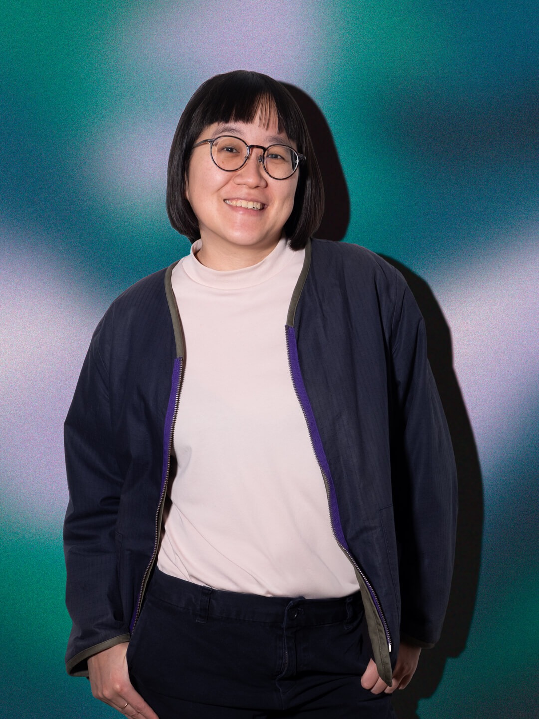
What it means to be sustainable in today’s fashion scene? We updated an urban fashion label to reflect the digital conditions of contemporary communication. The digital presence and new strategic framework were built to embrace a scalable eStore, dialogs and B2B markets opportunities.
Pssbl shares its grassroots in staying true to its social and environmental-friendly engagement. Word of mouth is important, however, establishing its position by expanding into branded content and projects with sustainable circular themes. The old-fashioned retailer now play a role beyond a presence as stockist, becoming a trendsetter with curated cityguides and editorial contributions. The new website hopes to provide a platform for multi-brand fashion and lifestyle retailers.
In collaboration with Neue Gestaltung
For the internationally renowned Leipzig Documentary Film Festival, we developed the entire website including a film archive and submission forms. Over 8000 films are migrated including credits, stills and more for a comprehensive film archive. The submission of films using multi-level forms has also been newly designed to give emphasis on the UX design in order to give users a clear overview of the submission steps. I was involved in developing the design during the MMP phase.
The identity created for the Komische Oper is as opulent as opera itself. It is as diverse as their audience and quirky by its character. Under new assignment, many traditions were maintained, however their digital presence is in need of further leaning and improving the usability.
In collaboration with State ╱ Web development by Spiritec GmbH
With ‘Digital Relations’, the research area “Sociology of Digitalisation” aims to promote scientific exchange on forward-looking research fields of the digital transformation and bring together recognised scientists and young researchers. In lively discussions, the workshops encourage new research field explorations beyond knowledge transfer, concepts of socio-technical arrangements are discussed and own findings are reflected in the light of new ideas. A bold key visual and a series of posters were presented to communicate the tension between concreteness and abstraction.
For Komische Oper, tradition is understood as a process of continuous renewal, and so does the look and feel of the online ticket system. Much attention is paid to detail: the tangibility and memorability of the ticketing experience, have become a much cherished feature of the brand.
In collaboration with State ╱ Web development by Spiritec GmbH
Coming soon
“Worldviews” are not only spatial and temporal and limited, they are also influenced by social circumstances. Science is not exempted from this: Despite the ideal of objectivity, researchers’ thoughts and actions are influenced by certain views of the world—scientific, but also non-scientific. For the 2020 edition of ”Salon Sophie Charlotte”, a series of posters were presented as a way-finding system; a flyer in form of a fanfold as a complimentary medium to the holographic installation; and a vibrant key visual to communicate the theme.
We created a new identity for a leading developer of racking systems for photovoltaic panels. Facing tough competition in a turbulent marketplace, and with a strategically crucial new product in the pipeline, we began working with the company during a phase of intense change. At the center of the new CI: a bold logotype, providing the company with an evocative, abstract mark underlining its legacy of engineering excellence and pointing self-confidently towards the future.
In collaboration with State
Winner of the German Brand Award 2018 in the categories “Product Brand of the Year” and “Building & Elements”
Key visual, poster series, podcast cover and digital adaptations for Bauhaus Digital Masterclass in the Media department of Weimar University. The Masterclass brought renowned national and international researchers and lecturers in a series of seminars devoted to fundamental questions on digitisation in the intersection of architecture, design and media.
Visual identity and an adaptable set of packaging system designed for in-house use. One of the most important aspects of creating a memorable brand is through elevating the standards of the product and clarity in information design to its targeted customers. A change in their look marks a big step of their business expansion.
An interactive project interplaying letterform, sound and visual abstraction. Other than the linguistic component to represent a formal aspect of information and comprehension, alphabets could be a carrier of musical codes. Toneletters could be reimagined on a live format in public spaces with data transmitted via daily news. With moving typography and sound, the web app allows users to participate both as a musician and listener.
Anja Walner is a eco-tailored fashion label. With the ‘fast fashion’ culture, Anja's work sought to communicate sustainable strategies to reuse textile from their old context and rearranges them to create something unique and exclusive. The corporate identity mirrors reduction in style and repurposing print materials via ‘print by demand’.
Editorial design of an annual report with a participative initiative to portray tendencies of the current architecture and interior design trends.
↑
What it means to be sustainable in today’s fashion scene? We updated an urban fashion label to reflect the digital conditions of contemporary communication. The digital presence and new strategic framework were built to embrace a scalable eStore, dialogs and B2B markets opportunities.
Pssbl shares its grassroots in staying true to its social and environmental-friendly engagement. Word of mouth is important, however, establishing its position by expanding into branded content and projects with sustainable circular themes. The old-fashioned retailer now play a role beyond a presence as stockist, becoming a trendsetter with curated cityguides and editorial contributions. The new website hopes to provide a platform for multi-brand fashion and lifestyle retailers.
In collaboration with Neue Gestaltung
For the internationally renowned Leipzig Documentary Film Festival, we developed the entire website including a film archive and submission forms. Over 8000 films are migrated including credits, stills and more for a comprehensive film archive. The submission of films using multi-level forms has also been newly designed to give emphasis on the UX design in order to give users a clear overview of the submission steps. I was involved in developing the design during the MMP phase.
In collaboration with State ╱ Web development by E-Fork
⭢ Website
For the Komische Oper Berlin, tradition is understood as a process of continuous renewal, and so does the look and feel of the online ticket system. Much attention is paid to detail: the tangibility and memorability of the ticketing experience, have become a much cherished feature of the brand.
In collaboration with State ╱ Web development by Spiritec GmbH
With ‘Digital Relations’, the research area “Sociology of Digitalisation” aims to promote scientific exchange on forward-looking research fields of the digital transformation and bring together recognised scientists and young researchers. In lively discussions, the workshops encourage new research field explorations beyond knowledge transfer, concepts of socio-technical arrangements are discussed and own findings are reflected in the light of new ideas. A bold key visual and a series of posters were presented to communicate the tension between concreteness and abstraction.
For Komische Oper, tradition is understood as a process of continuous renewal, and so does the look and feel of the online ticket system. Much attention is paid to detail: the tangibility and memorability of the ticketing experience, have become a much cherished feature of the brand.
In collaboration with State ╱ Web development by Spiritec GmbH
“Worldviews” are not only spatial and temporal and limited, they are also influenced by social circumstances. Science is not exempted from this: Despite the ideal of objectivity, researchers’ thoughts and actions are influenced by certain views of the world—scientific, but also non-scientific. For the 2020 edition of ”Salon Sophie Charlotte”, a series of posters were presented as a way-finding system; a flyer in form of a fanfold as a complimentary medium to the holographic installation; and a vibrant key visual to communicate the theme.
We created a new identity for a leading developer of racking systems for photovoltaic panels. Facing tough competition in a turbulent marketplace, and with a strategically crucial new product in the pipeline, we began working with the company during a phase of intense change. At the center of the new CI: a bold logotype, providing the company with an evocative, abstract mark underlining its legacy of engineering excellence and pointing self-confidently towards the future.
In collaboration with State
Winner of the German Brand Award 2018 in the categories “Product Brand of the Year” and “Building & Elements”
Key visual, poster series, podcast cover and digital adaptations for Bauhaus Digital Masterclass in the Media department of Weimar University. The Masterclass brought renowned national and international researchers and lecturers in a series of seminars devoted to fundamental questions on digitisation in the intersection of architecture, design and media.
Visual identity and an adaptable set of packaging system designed for in-house use. One of the most important aspects of creating a memorable brand is through elevating the standards of the product and clarity in information design to its targeted customers. A change in their look marks a big step of their business expansion.
An interactive project interplaying letterform, sound and visual abstraction. Other than the linguistic component to represent a formal aspect of information and comprehension, alphabets could be a carrier of musical codes. Toneletters could be reimagined on a live format in public spaces with data transmitted via daily news. With moving typography and sound, the web app allows users to participate both as a musician and listener.
Anja Walner is a eco-tailored fashion label. With the ‘fast fashion’ culture, Anja's work sought to communicate sustainable strategies to reuse textile from their old context and rearranges them to create something unique and exclusive. The corporate identity mirrors reduction in style and repurposing print materials via ‘print by demand’.
Editorial design of an annual report with a participative initiative to portray tendencies of the current architecture and interior design trends.
What i deliver
Branding and consultancy
Corporate design and visual identity
Web design (UI/UX)
Campaign
Book and magazine design
Information design
Signage and environmental design
Selected clients
Verband der Musik- und Kunsthochschulen Brandenburg, Komische Oper Berlin, DOK Leipzig, Die Junge Akademie, Leibniz Universität Hannover, Bauhaus100, Mounting Systems, Migros Industry, Siemens, Audi, Pssbl, stilnest, Konzerthaus Berlin, Bäumlin+John, Shift Festival, Od-Theater, Culturescapes, VCR Café and Japan Foundation
Awards
German Brand Awards Winner
‘Excellence in Brand’ & ‘Product of the Year’ for Mounting Systems GmbH
— 2018, Germany
102030 Antalis “Young Gun of the Year”
Selected as the Young Gun by 10 established creatives in Malaysia
— 2013, Malaysia