A sparring partner for future infrastructure advancement
My roles
Corporate Design, UI/UX Design, Design System, IA
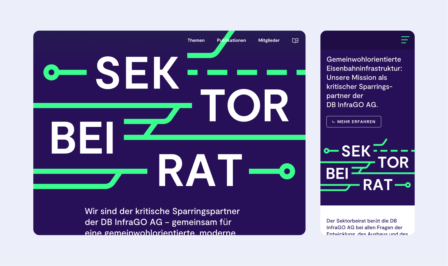
Sektorbeirat advises DB InfraGO AG on all issues relating to the development, expansion and maintenance of the German rail network. The committee is made up of representatives or representatives of rail transport companies and the organisations of the federal states responsible for the local transport.
Spearheading identity and landing page
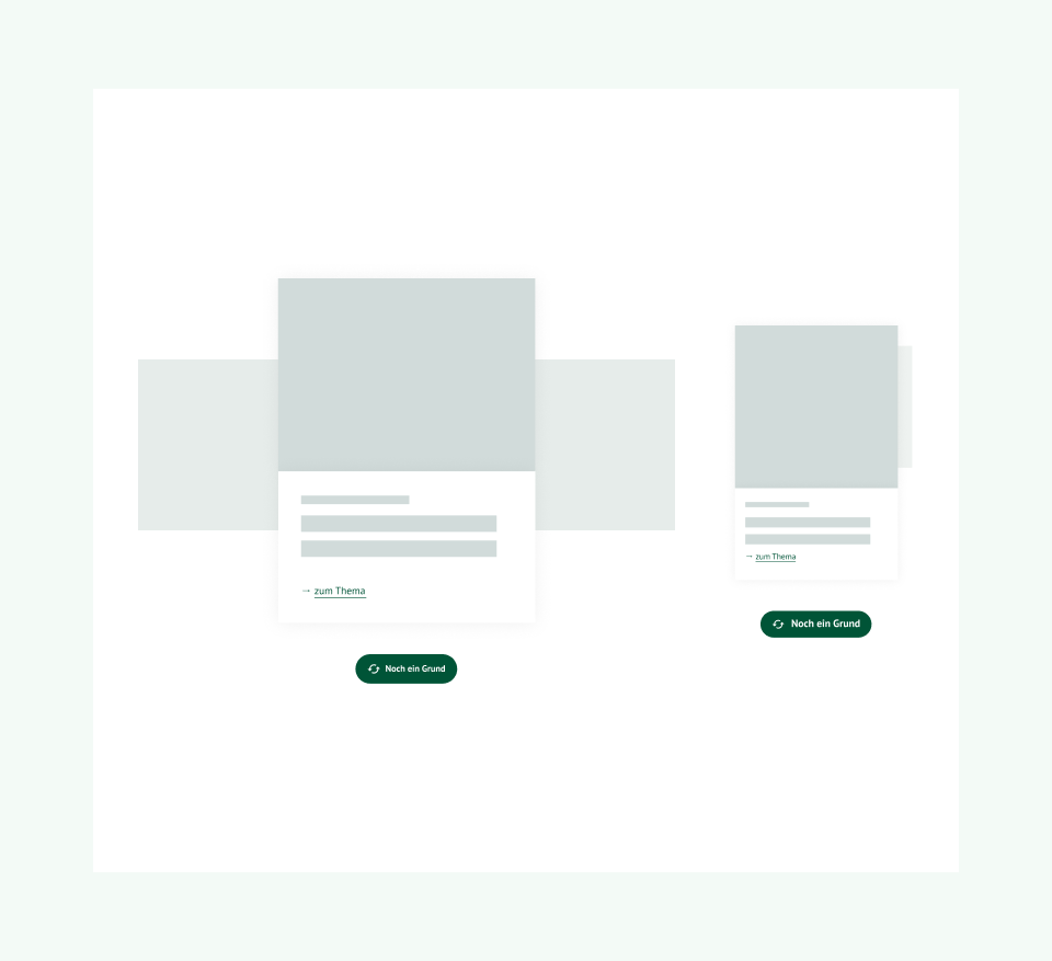
Our approach to the web design overhaul is sustainable and responsible, balancing strategic design solutions by enabling the visual elements and (most importantly) content to take the center stage. For the project, we successfully enhanced the information architecture and navigation flows and introduced new approachable entry points into their complex political contents.
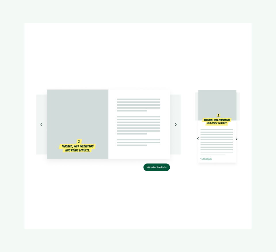
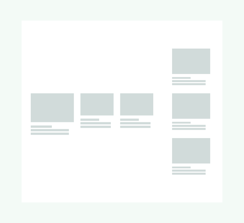
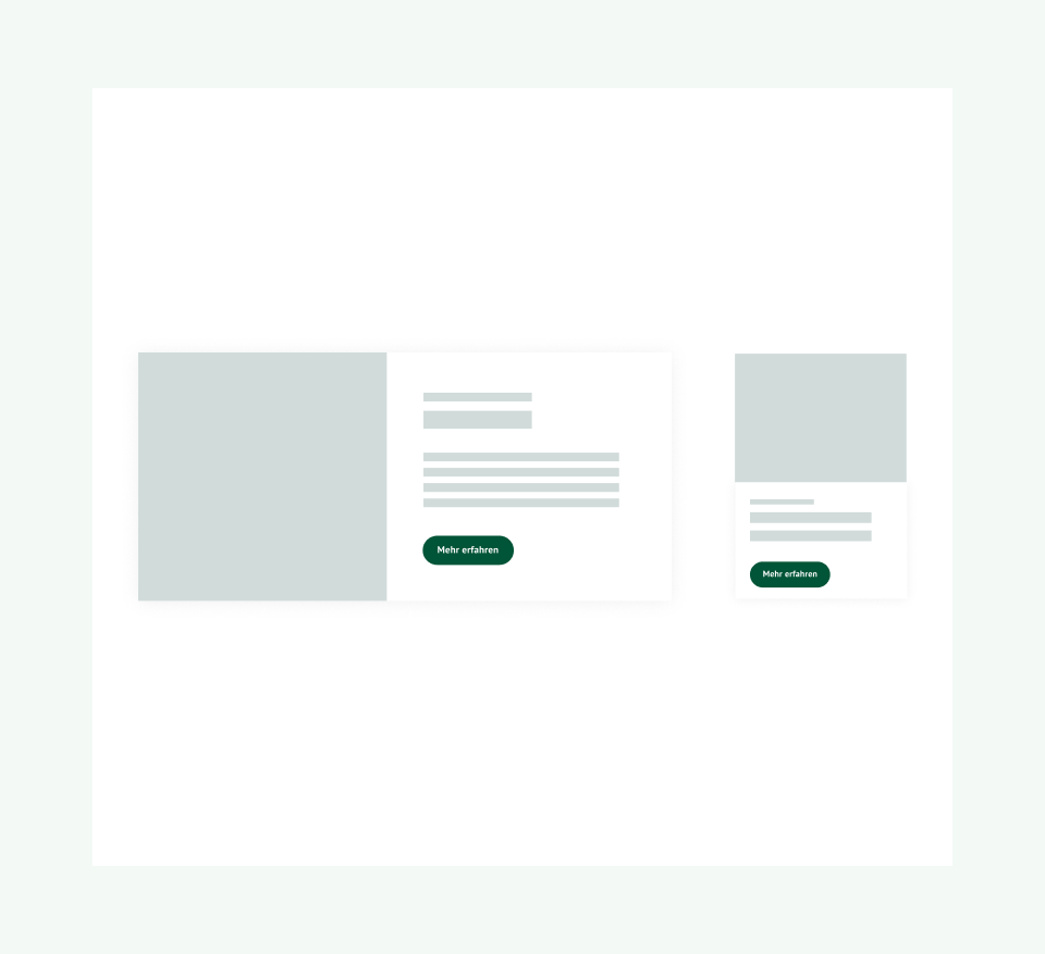
We use a scalable modular principle to implement content-specific requirements. Using clearly defined elements, templates and components, the contents are able to be differentiated, while bringing a consistent appearance across the entire website.

Visual research into railway history
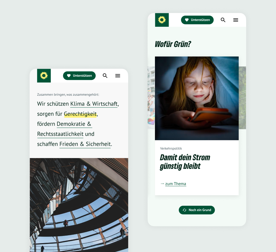
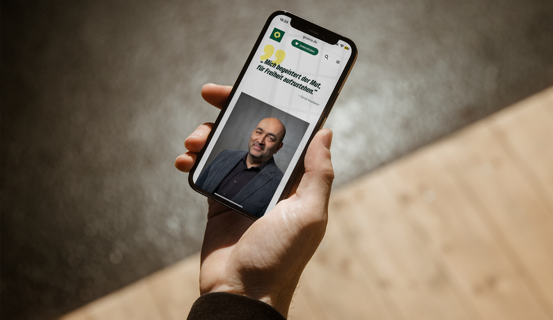
We developed a design system that is consistent with the existing gruene.de style guide, while challenging the status quo of the style guide by expanding the official colour scheme's use cases beyond its print-based limits. The combination of thematic icons, placement of people in the foreground and the accent color palette to manifest the party’s transformation, renewal and change.

IA in navigating minds and impact
We defined the visual and typographic hierarchies, interactions and transitions, expanded and defined the design systems which helped to organize the structure of the web interfaces. We also believe that a certain clarity can be achieved by the use of proportional scaling on modules to highlight the party’s milestone and core themes.

Tim de Gruisbourne, UX Design Team Lead
In collaboration with adlerschmidt
Design Direction: Tim de Gruisbourne
Design: Evey Kwong, Pia Denker and Katrin Schirmer
Has this case study convinced you?
Got a project to talk about or just want to chat?
Visit me
Genter Strasse 71
13353 Berlin
Contact me
mailme@eveykwong.com
+49 (0)30 588 539 50
©Evey Kwong 2024
Imprint
Data Privacy
A sparring partner for future infrastructure advancement

Client
Sektorbeirat
for DB InfraGO
2024
Website ⭢
My roles
Corporate Design, UI/UX Design, Design System, IA
Sektorbeirat advises DB InfraGO AG on all issues relating to the development, expansion and maintenance of the German rail network. The committee is made up of representatives or representatives of rail transport companies and the organisations of the federal states responsible for the local transport.
Spearheading identity and landing page


Our approach to the visual identity is ...
Combination of schematic and graphical visual identity
The desire to give the advisory a modern look, however a standalone look, with not to coincide with the existing infrastructure design identities.
A wordmark is
- circular / geometric typeface
Visual research into railway history

We developed a design system that is consistent with the existing gruene.de style guide, while challenging the status quo of the style guide by expanding the official colour scheme's use cases beyond its print-based limits. The combination of thematic icons, placement of people in the foreground and the accent color palette to manifest the party’s transformation, renewal and change.

IA in navigating mind and impact

We defined the visual and typographic hierarchies, interactions and transitions, expanded and defined the design systems which helped to organize the structure of the web interfaces. We also believe that a certain clarity can be achieved by the use of proportional scaling on modules to highlight the party’s milestone and core themes.


Tim de Gruisbourne, UX Design Team Lead
In collaboration with adlerschmidt
Design Direction: Tim de Gruisbourne
Design: Evey Kwong, Pia Denker and Katrin Schirmer
Has this case study convinced you? Got a project to talk about or just want to chat?
Visit me
Genter Strasse 71
13353 Berlin
Contact me
mailme@eveykwong.com
+49 (0)30 588 539 50
©Evey Kwong 2024
Imprint
Data Privacy
Visit me
Genter Strasse 71
13353 Berlin
Contact me
mailme@eveykwong.com
+49 (0)30 588 539 50
©Evey Kwong 2024
Imprint
Data Privacy
Visit me
Genter Strasse 71
13353 Berlin
Contact me
mailme@eveykwong.com
+49 (0)30 588 539 50
©Evey Kwong 2024
Imprint
Data Privacy